The 2020 Material UI Developer Survey: here's what we discovered
Continuing the tradition from last year, we launched a Developer Survey a few months ago, to which we received 1488 responses. This is twice as many as last year (734), so we thank you all for your participation! The survey is closed and we can now give a detailed summary of the results.
Like last year, the survey was again broken into three sections: "Introduction", "About you" and "Your product".
Introduction
In this section, we wanted to hear what developers think is going well, what we should keep doing, and which areas need improving to make the library even better.
1. How would you feel if you could no longer use Material UI?
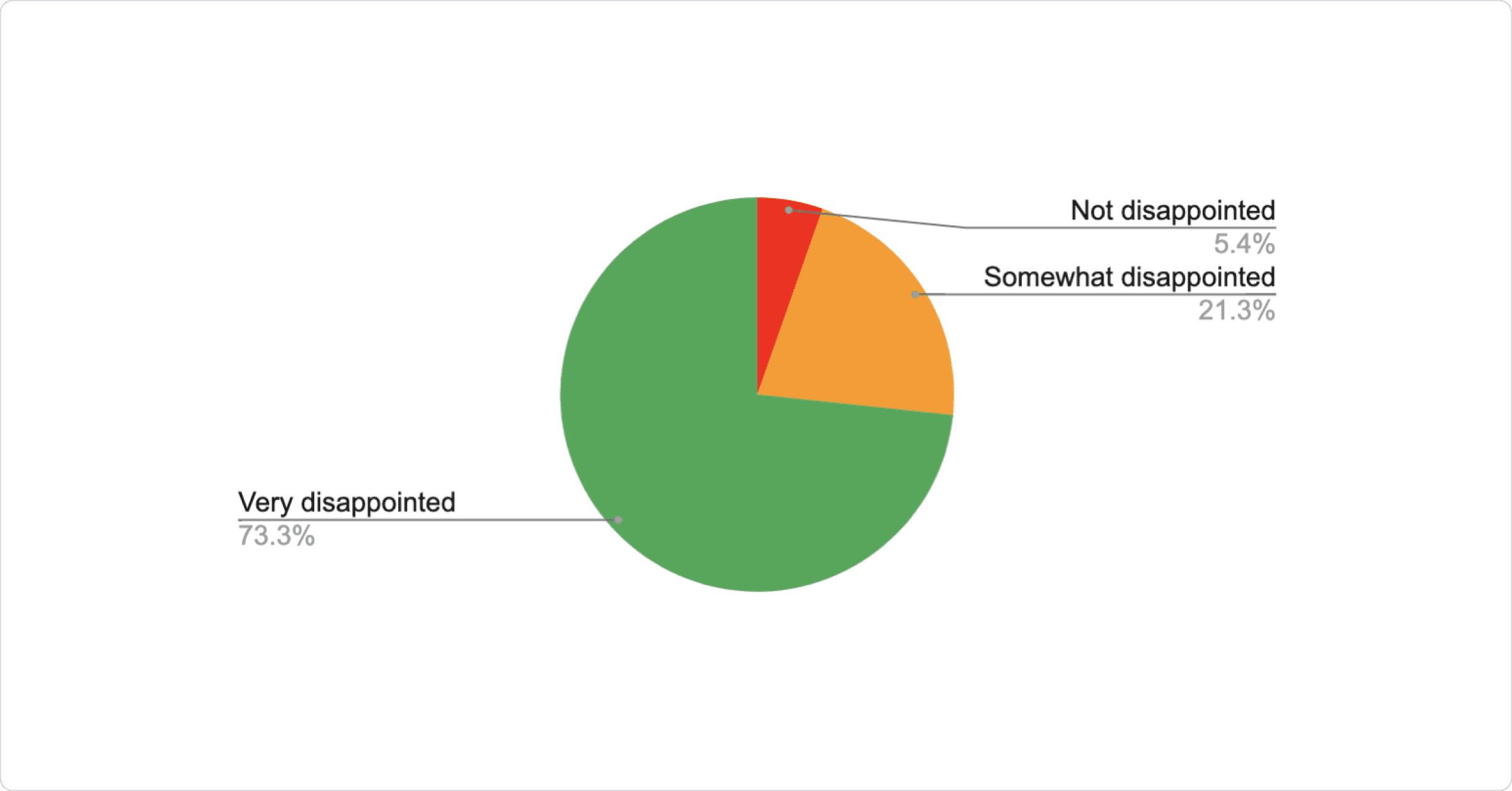
Similar to last year, over 94% of the respondents would be disappointed if they could no longer use Material UI, which is very encouraging. We will keep working hard to hopefully move more of you into the "very disappointed" category!
The number of respondents who would not be disappointed has moved down from 6.5% to 5.4%, which is technically a 17% improvement! 🙂 We'd love to understand more about those who use Material UI, but would happily use other solutions, so a follow-up question might be needed next year.
2. How likely is it that you would recommend Material UI to a friend or colleague?
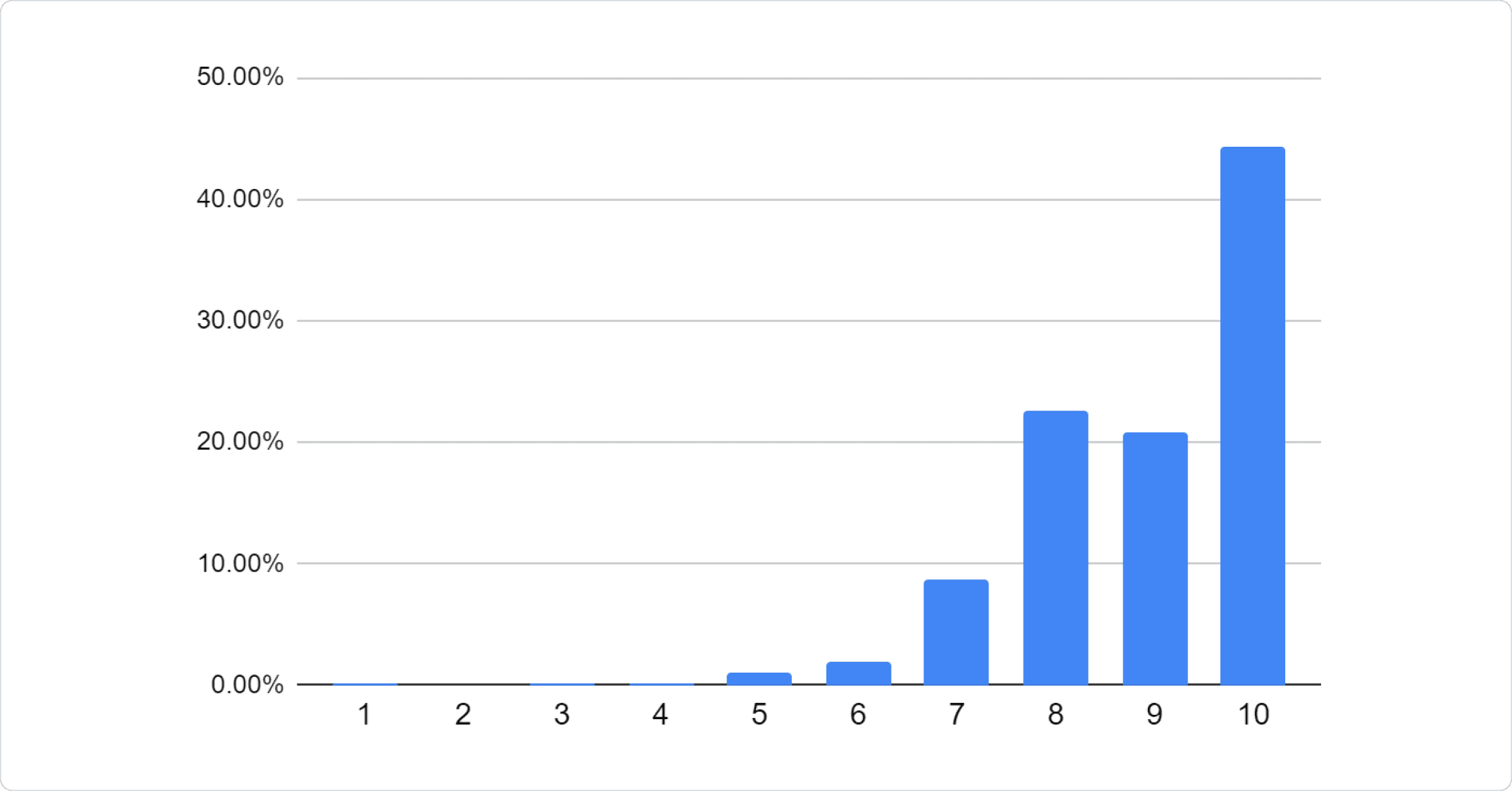
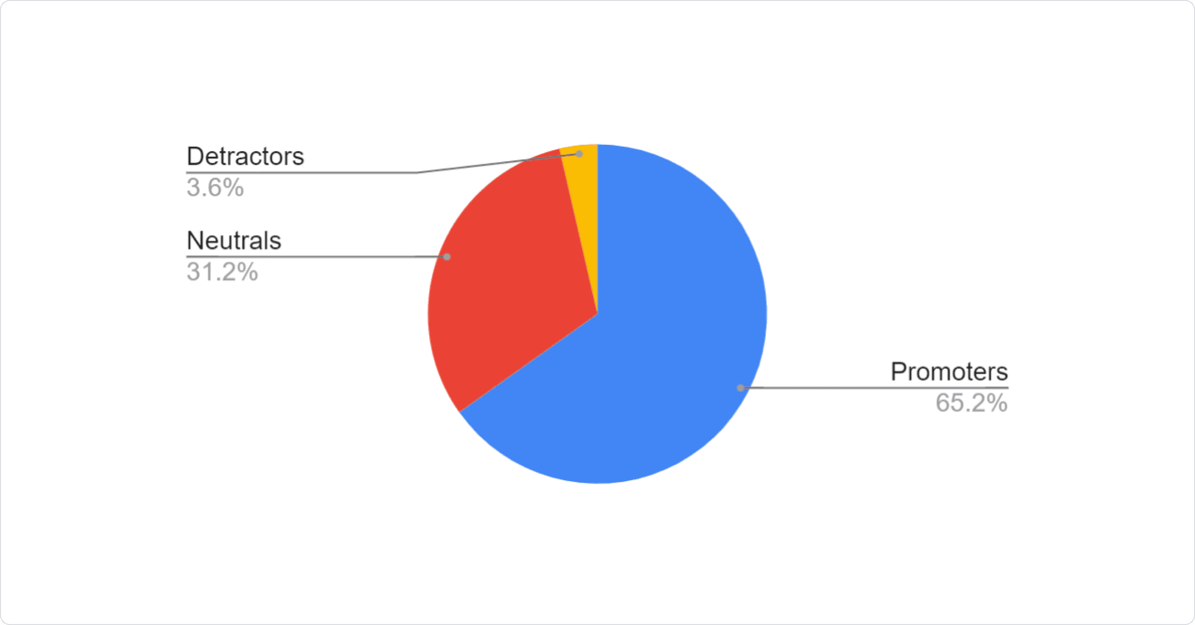
As last year, we again calculated the Net Promoter Score (promoters less detractors). This year it is again a pretty high number 61.54%! (As the values for NPS range between -100 and +100, a "positive" score is considered "good", greater than 50 is "excellent", and above 70 is considered "world class").
3. Who do you think would most benefit from Material UI?
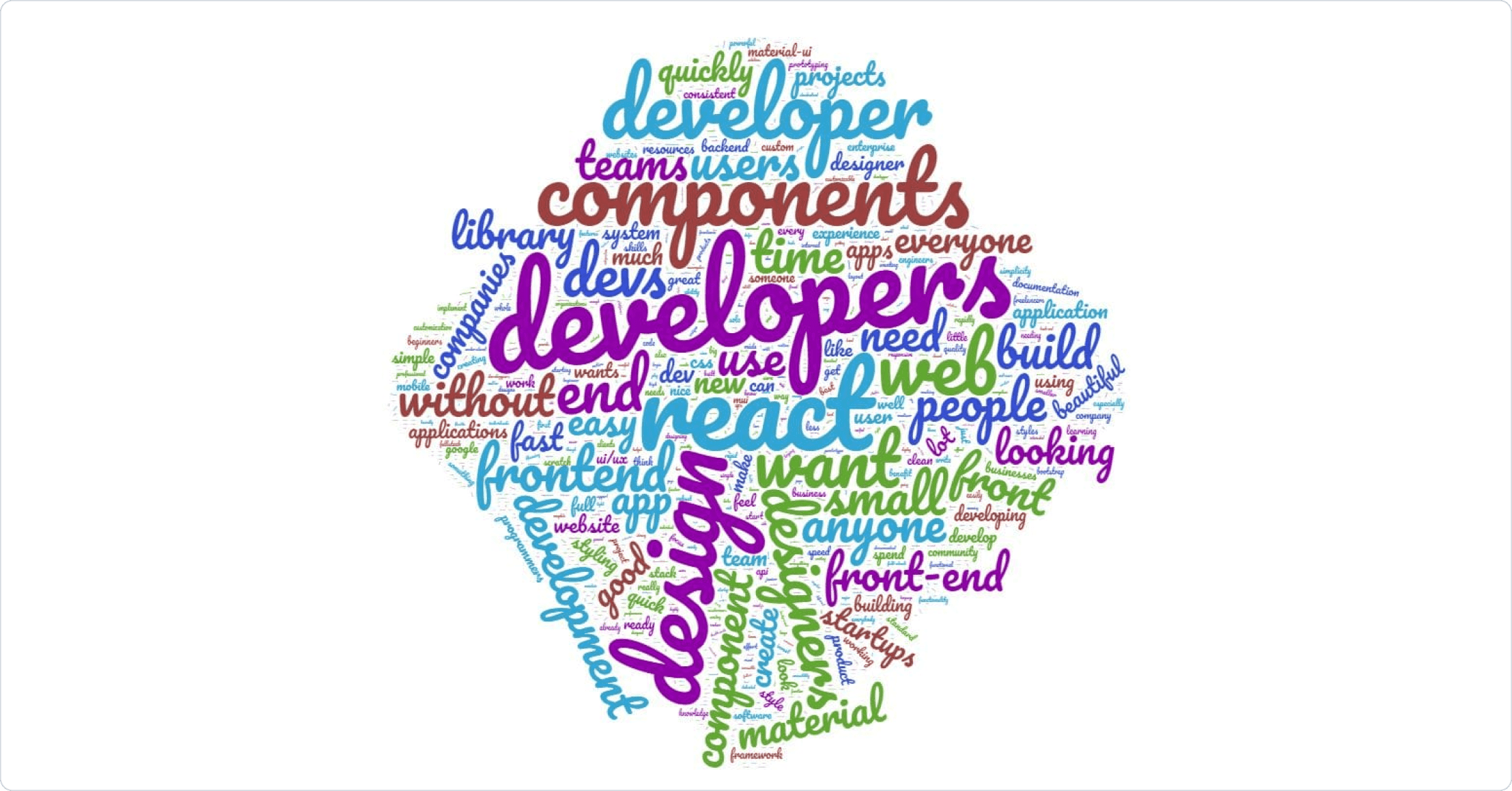
This word cloud was generated with wordclouds.com.
Developers are again at the center of our universe 🙂 (And "people" and "teams" in general, of course!) This is understandable, given the job role demographic of the majority of respondents. We will push hard on making the experience for you even better over the next year.
4. What is the main benefit you receive from Material UI?
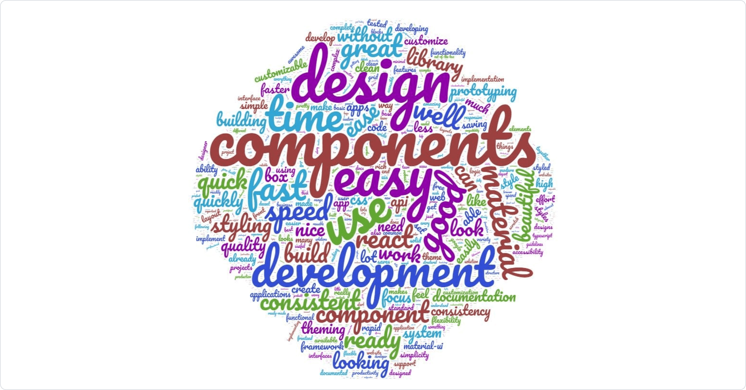
The responses to this question are a very clear indicator to us about what we need to continue to do more of. Some of the most common points were: the range of components, ease of use, documentation quality, as well as the design. We will, of course, continue to work on all of these.
5. How can we improve Material UI for you?
As the answers to these questions were pretty different, we grouped them into different categories and counted the different number of times the concern was mentioned. You can see all of them sorted in descending order:
| 306 | more components |
|---|---|
| 202 | more components - ? |
| 15 | more components - data grid |
| 12 | more components - carousel |
| 12 | more components - charts |
| 10 | more components - lab to core |
| 10 | more components - upload |
| 9 | more components - icons |
| 6 | more components - big calendar |
| 5 | more components - layout |
| 4 | more components - navbar |
| 4 | more components - nested menu |
| 2 | more components - rich text editor |
| 2 | more components - splitter |
| 1 | more components - masonry |
| 1 | more components - nav bar |
| 1 | more components - numberpad |
| 1 | more components - onboarding |
| 1 | more components - prompt |
| 1 | more components - scrollspy |
| 1 | more components - swappable tabs |
| 1 | more components - timeline |
| 1 | more components - video player |
| 1 | more components - virtualization |
| 1 | more components - drag and drop |
| 1 | more components - dropdown |
| 1 | more components - image |
| 189 | customization |
| 85 | customization - easier |
| 22 | customization - docs |
| 16 | customization - dynamic color & variant |
| 15 | customization - improve custom themes |
| 13 | customization - provide more themes (not just Material Design) |
| 11 | customization - ? |
| 9 | customization - unstyled components |
| 8 | customization - support system in all components |
| 8 | customization - theme editor (visual tool) |
| 2 | customization - theme gallery (coming from the community) |
| 155 | docs |
| 46 | docs - ? |
| 45 | docs - more examples |
| 33 | docs - more templates |
| 16 | docs - beginner friendly |
| 8 | docs - smaller demos |
| 8 | docs - tutorials |
| 3 | docs - api integration with components |
| 2 | docs - better search |
| 2 | docs - spanish |
| 1 | docs - chinese |
| 1 | docs - translations |
| 1 | docs - detailed api |
| 1 | docs - easier discoverability of components |
| 1 | docs - generated DOM |
| 1 | docs - japanese |
| 1 | docs - more realistic examples |
| 1 | docs - nested props |
| 1 | docs - plugins |
| 1 | docs - ssr |
| 64 | performance |
| 31 | performance - ? |
| 32 | performance - bundle size |
| 1 | performance - DOM size |
| 56 | styles |
| 19 | styles - styled components |
| 7 | styles - docs |
| 5 | styles - simpler |
| 4 | styles - ? |
| 3 | styles - CSS syntax |
| 3 | styles - better dark/light switch |
| 3 | styles - emotion |
| 3 | styles - performance |
| 2 | styles - agnostic to engine |
| 2 | styles - CSS modules |
| 2 | styles - utility class names |
| 1 | styles - atomic compiled CSS-in-JS |
| 1 | styles - keep jss |
| 1 | styles - remove JSS |
| 25 | typescript |
| 19 | typescript - ? |
| 3 | typescript - docs |
| 3 | typescript - faster check |
| 21 | date picker - improve |
| 19 | react native |
| 13 | form |
| 13 | material design updates |
| 12 | animations |
| 8 | animations - ? |
| 2 | animations - docs |
| 1 | animations - declarative API |
| 1 | animations - SVG |
| 11 | test |
| 4 | test - jest |
| 3 | test - stable snapshot |
| 1 | test - ? |
| 1 | test - docs |
| 1 | test - styles |
| 1 | test - testing library integration |
| 8 | more opinionated |
| 8 | simplify |
| 7 | class components |
| 7 | mobile |
| 7 | fewer breaking changes |
| 7 | designers |
| 2 | designers - bridge design tools and code |
| 2 | designers - Adobe XD material |
| 2 | designers - Figma material |
| 1 | designers - ? |
| 6 | free vs paid balance |
| 6 | tree view - improve |
| 6 | less abstracted components |
| 5 | more abstracted components |
| 4 | accessibility |
| 1 | accessibility - ? |
| 1 | accessibility - auto id |
| 1 | accessibility - full audit |
| 1 | accessibility - more examples |
| 4 | system |
| 1 | system - CSS grid |
| 1 | system - docs |
| 1 | system - performance |
| 1 | system - rework breakpoints |
| 3 | components consistency |
| 3 | grid - improve |
Comparison with last year
There are a couple of noticeable differences compared to last year. Some can be explained by our work, others by the evolution of the ecosystem. Each item is prefixed by the multiplication factor of the pain point for 2020 relative to 2019.
Decreasing pain:
- x0: Slider. No requests. The requirements are mostly met, especially with the introduction of the range feature.
- x0.1: Strict mode. We fixed a lot of strict mode compatibility issues this year. However, since Create React App has made this mode a default, we have seen a lot more requests for it.
- x0.1: Autocomplete. We added a new component, and have resolved a large number of issues opened since. This will be moved from lab to the core in v5.
- x0.2: Fewer breaking changes. Only releasing minor versions under v4 for over a year helps a lot. However, we still need to be careful with CSS changes.
- x0.3: Accessibility. We have been able to leverage GitHub issues opened by a11y experts, often coming from large companies using Material UI at scale to improve it a lot this year.
- x0.4: Material Design. We didn't do much for it this year, at least not as much as we could have. Maybe the reduction is because fewer people care? It seems that we start to resonate more with developers building custom design systems.
- x0.4: TypeScript. The continued migration of all the demos to TypeScript and of all the props to IntelliSense is paying off.
- x0.5: Date picker. We did a lot for it this year. We probably still need the range feature, and to move it into the main repository (docs migration, etc.) for consistency.
- x0.7: Performance. We didn't do much this year, so perhaps developers are leveraging React more effectively with virtualization, update pruning, etc?
Growing pains:
- ∞: Forms is a new item. It seems that we should at least work more closely with react-hook-form, formik, and react-final-form.
- ∞: Charts is a new item. Material Design even has a page dedicated to date visualization.
- x5: Custom themes.
- x5: Simpler customization. We have improved customizability this year by introducing global class names and reducing the CSS specificity of some selectors. However, it seems that we are now tapping into a new audience. We need to do better.
- x1.5: Animations.
- x1.2: React native. We still have no plans for it. The market is too small to make it sustainable with our model.
- x1.1: More components. The more we offer, the more developers ask for! We will try to help solve this with the enterprise version, both because it's the best model we have found that can sustain the development of advanced components, and because it allows us to reinvest in the open source components. The first early access will land this year.
6. What are your key criteria when choosing a UI library?
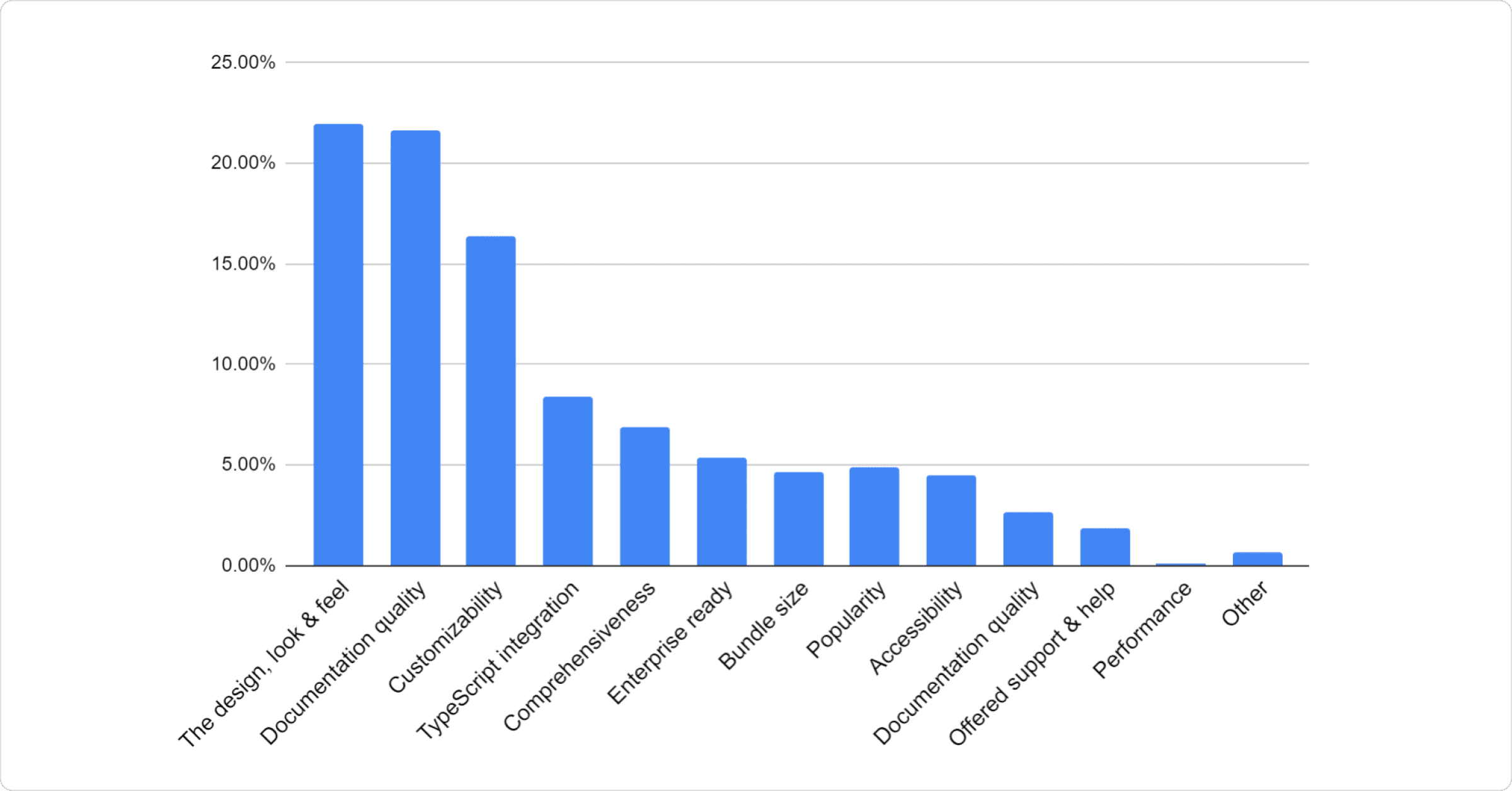
The number of answers was limited to 3.
About you
7. How did you hear about Material UI?
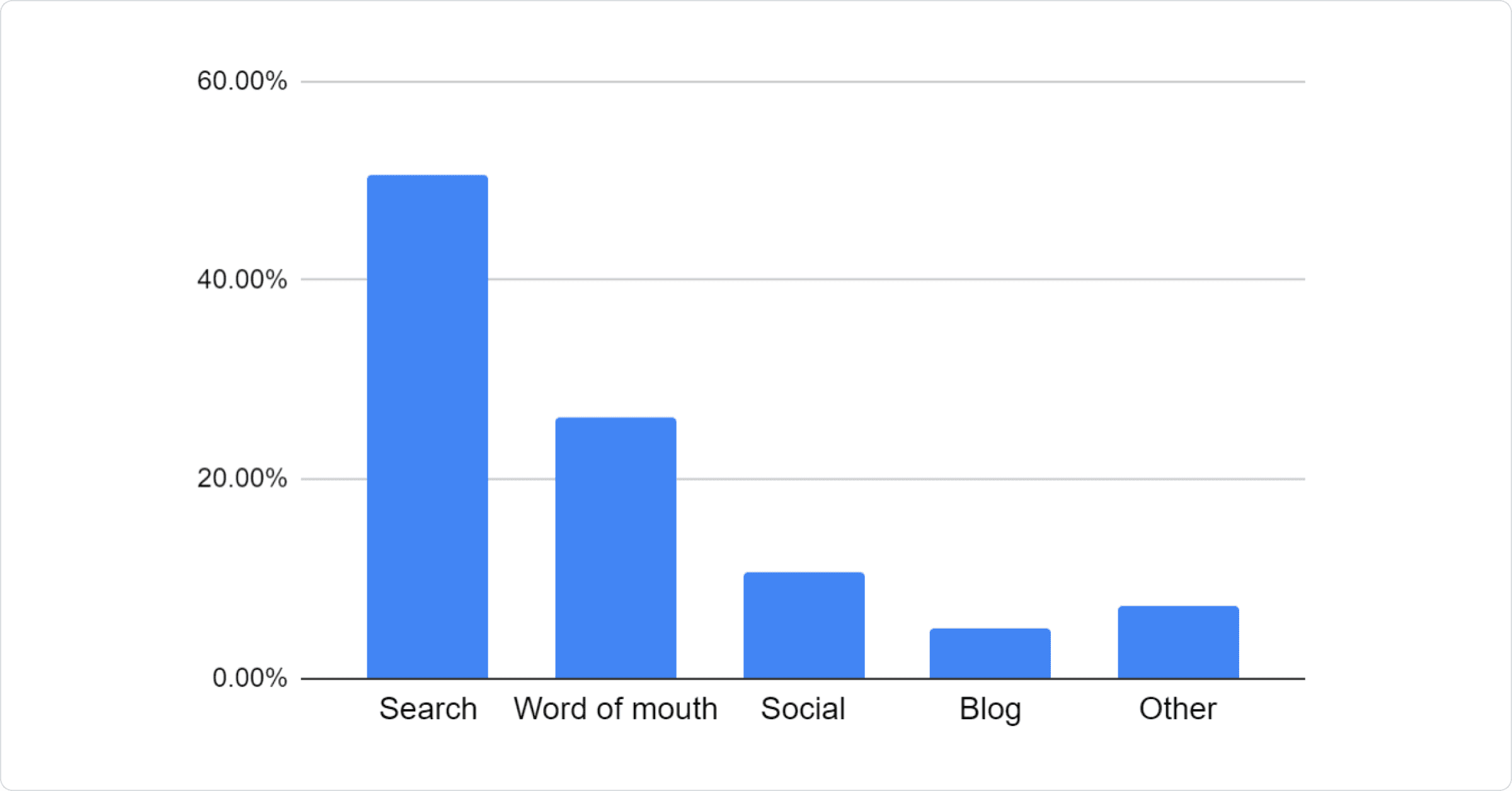
8. Which of the following best describes your current job role?
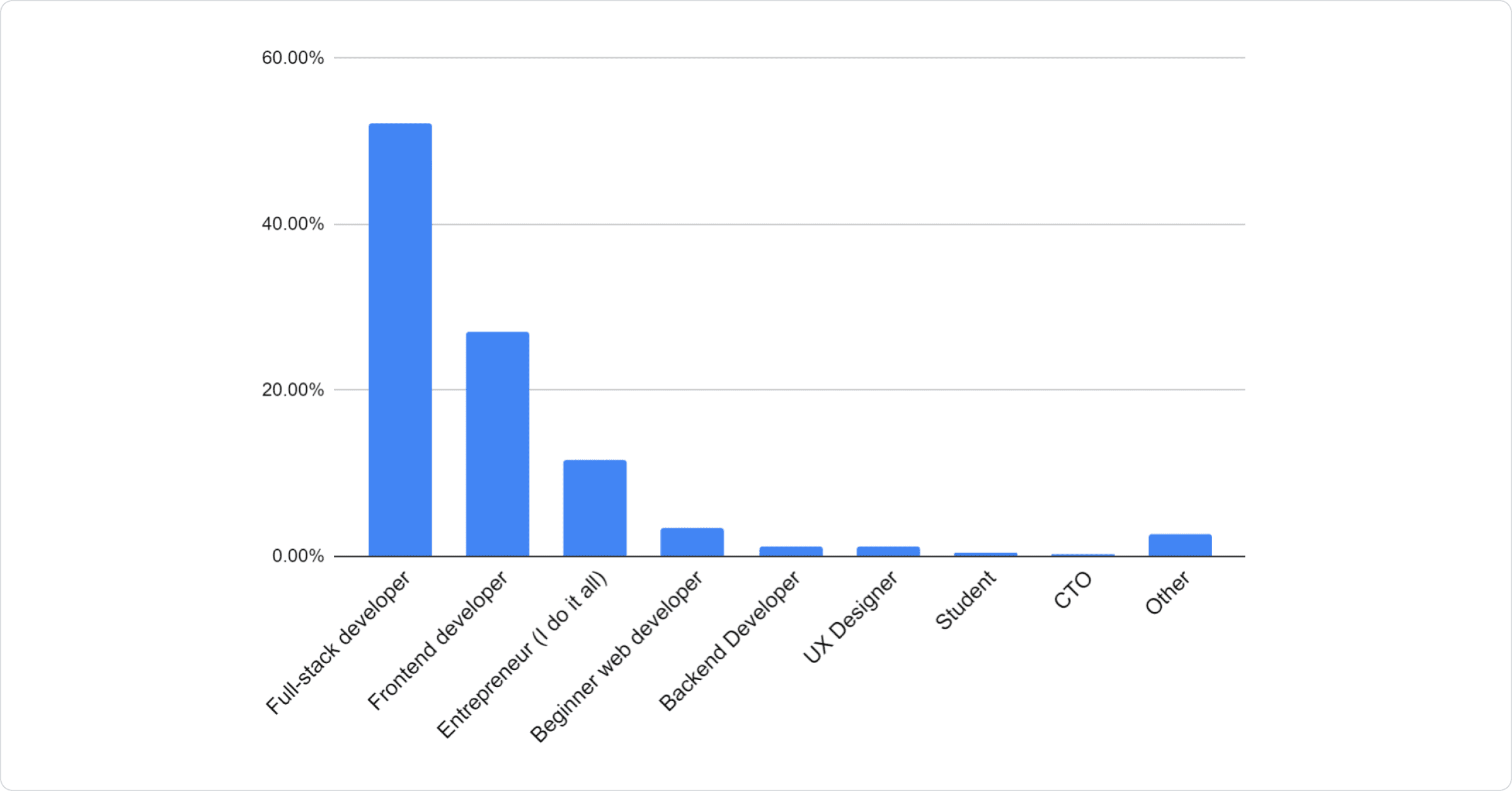
This was expected :)
9. How big is your organization?
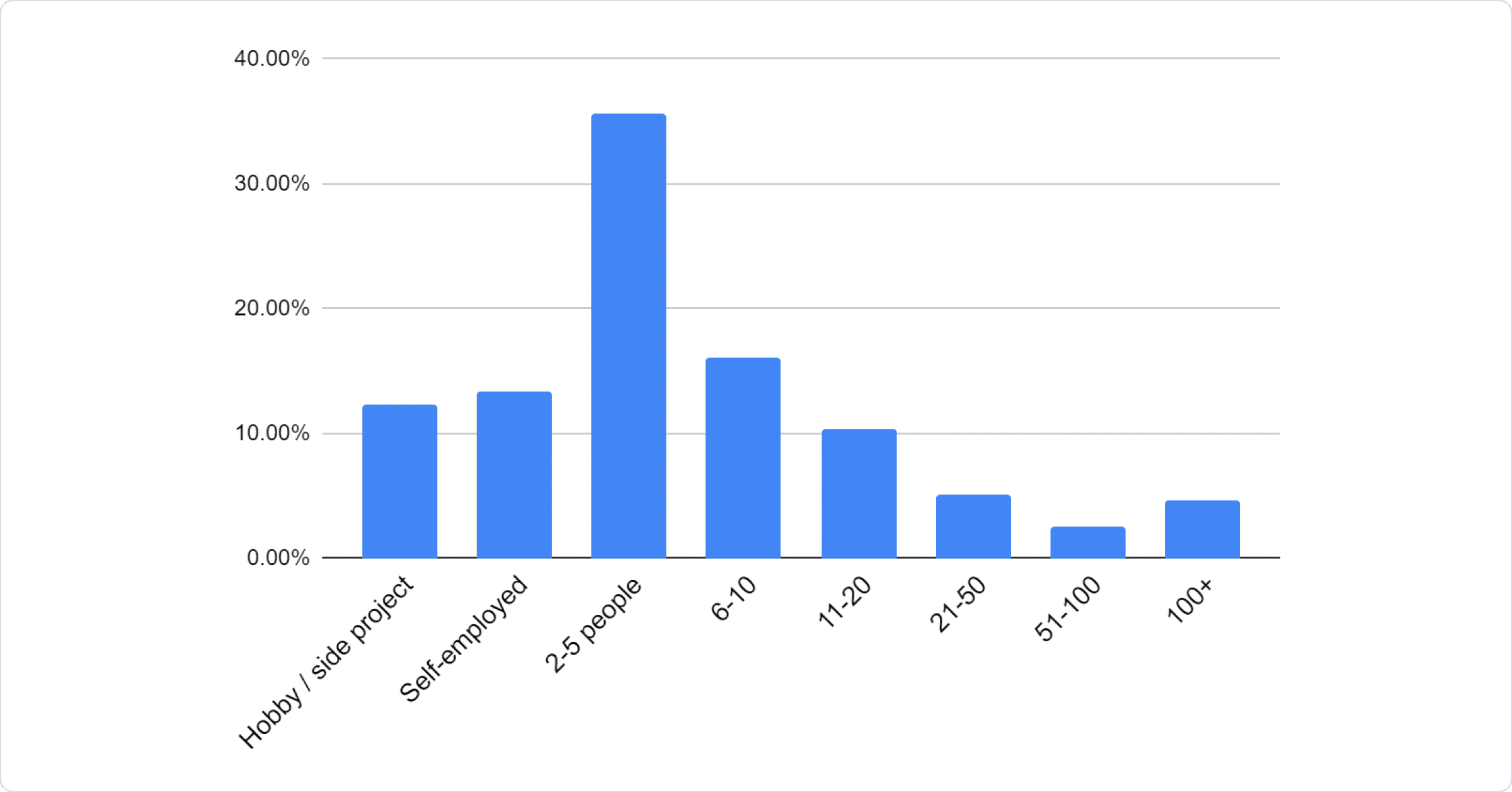
It seems we are consistently popular with small to medium-sized organizations, so we will keep working on the ease of use of the components, while at the same time, allowing designers to style them to match their organizations' brand.
10. How long have you been developing with JavaScript
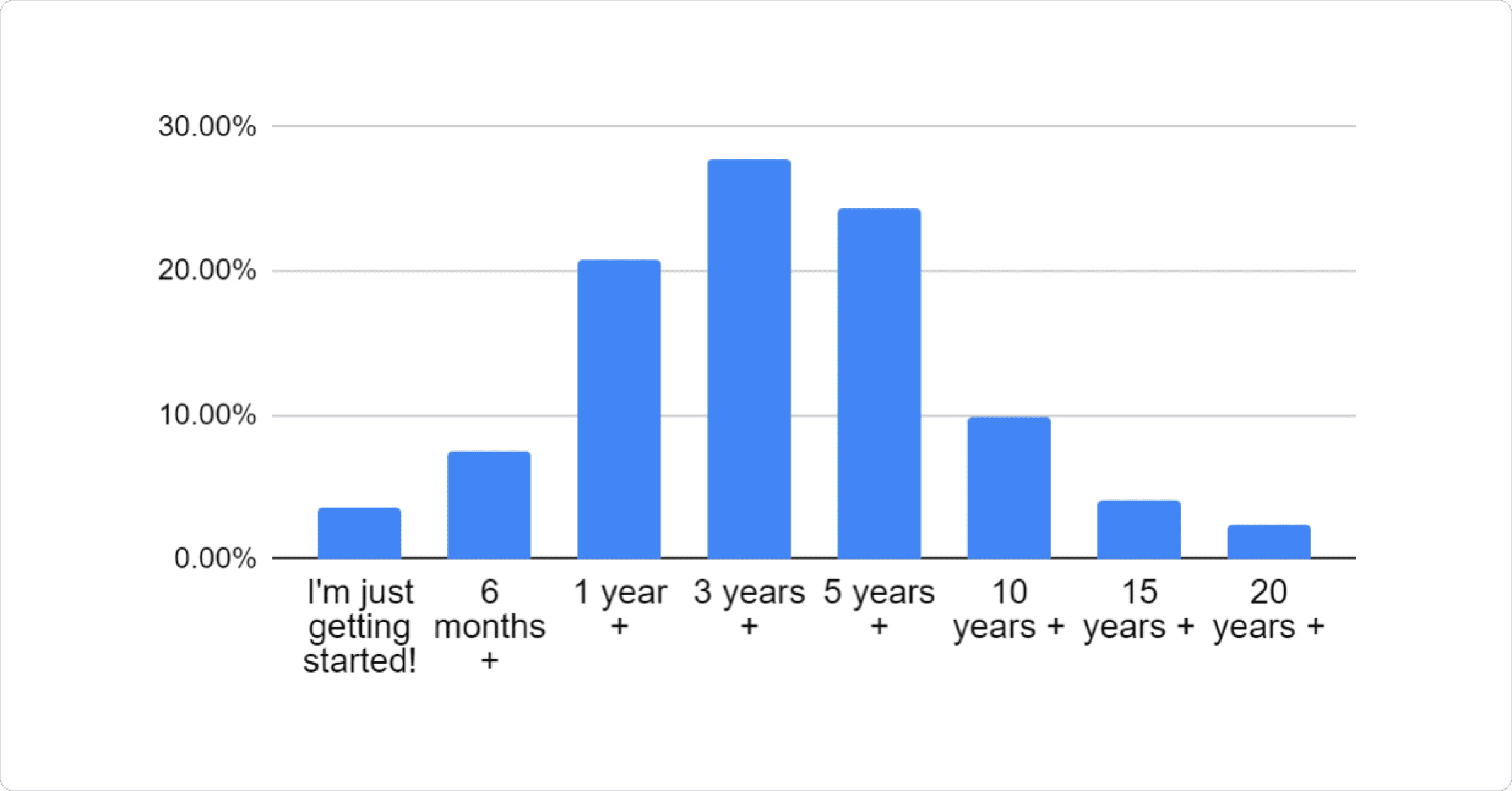
We can see the normal distribution of developer experience here, where most have moderate level of experience (between 1 and 5 years).
11. How long have you been developing with React?
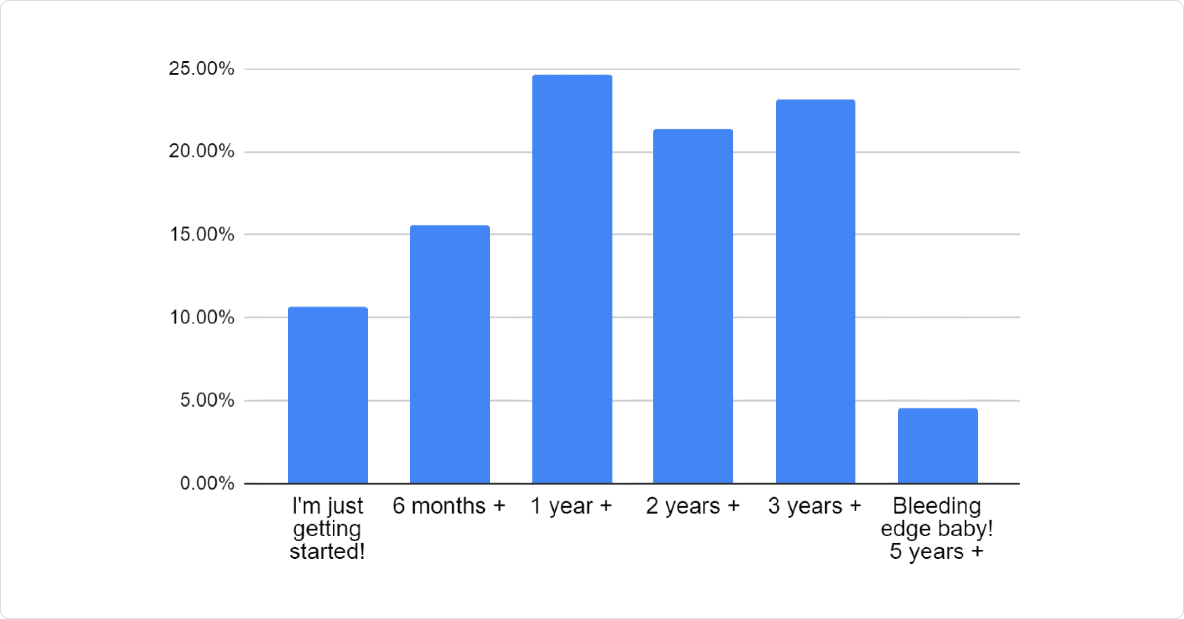
12. How long have you been developing with Material UI?
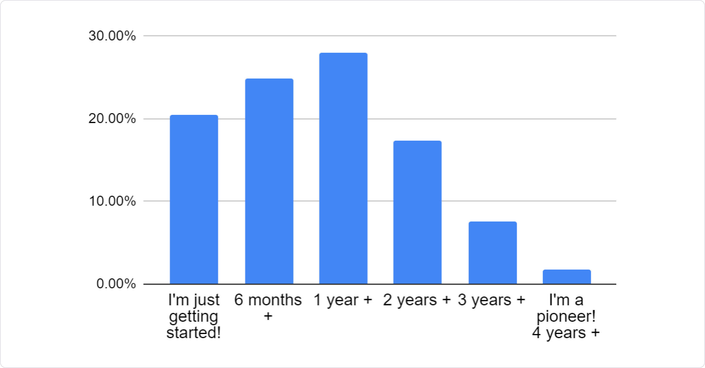
13. What were you primarily using before Material UI?
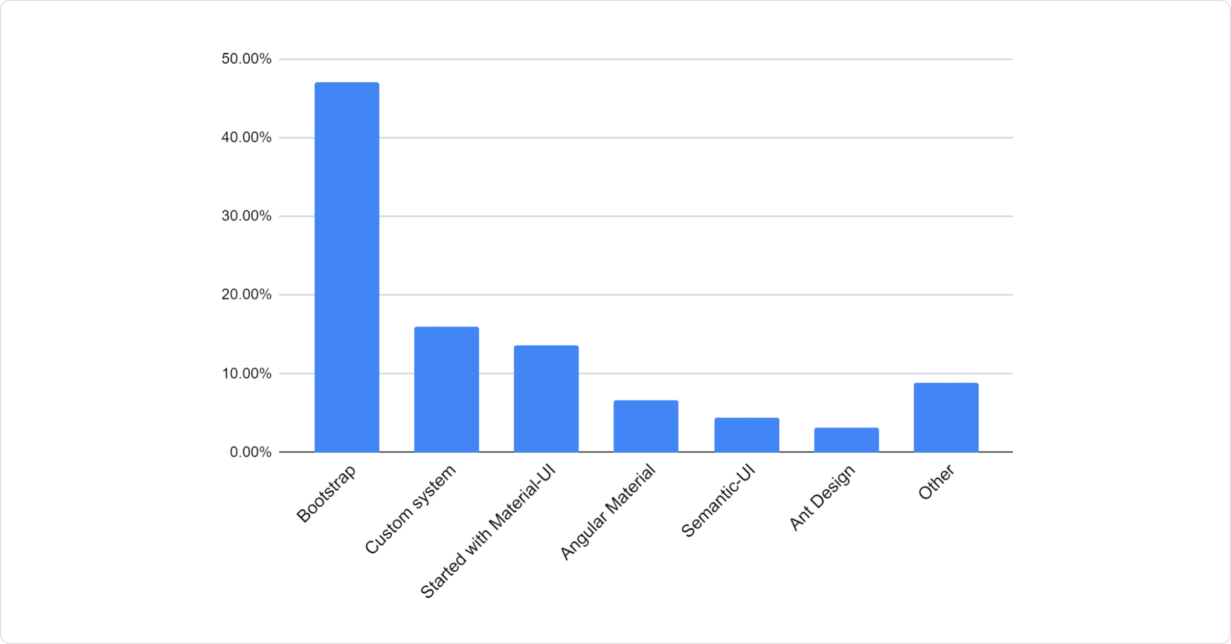
Similar to last year, it seems that most respondents were previously using Bootstrap. We can see also that custom solutions, as well as some other frameworks, were replaced with Material UI.
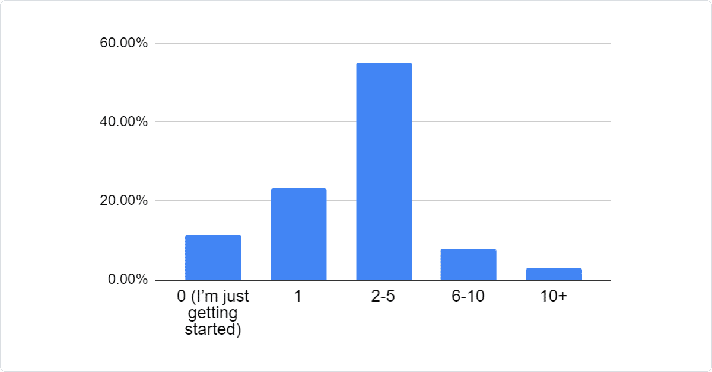
14. How many Material UI based projects have you built?
Your product
15. What are you building?
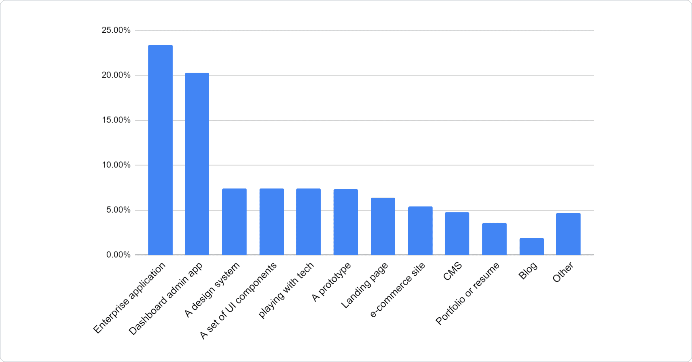
Enterprises and dashboards are at the top of the heap, and yes, we know that for many of you, the systems you are building are internal, but if you have something that you would like to share as part of the showcase, let us know by opening a PR. Also for those of you building UI components, we'd be happy to give you a shout out in the related projects section.
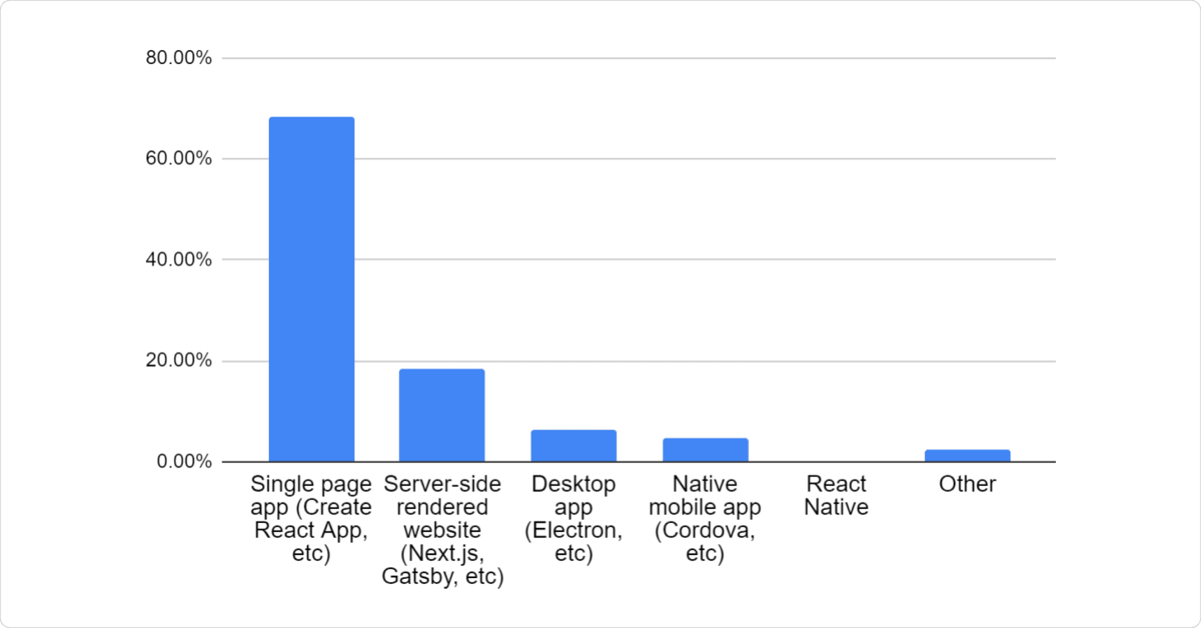
16. What "delivery mechanism" are you using?
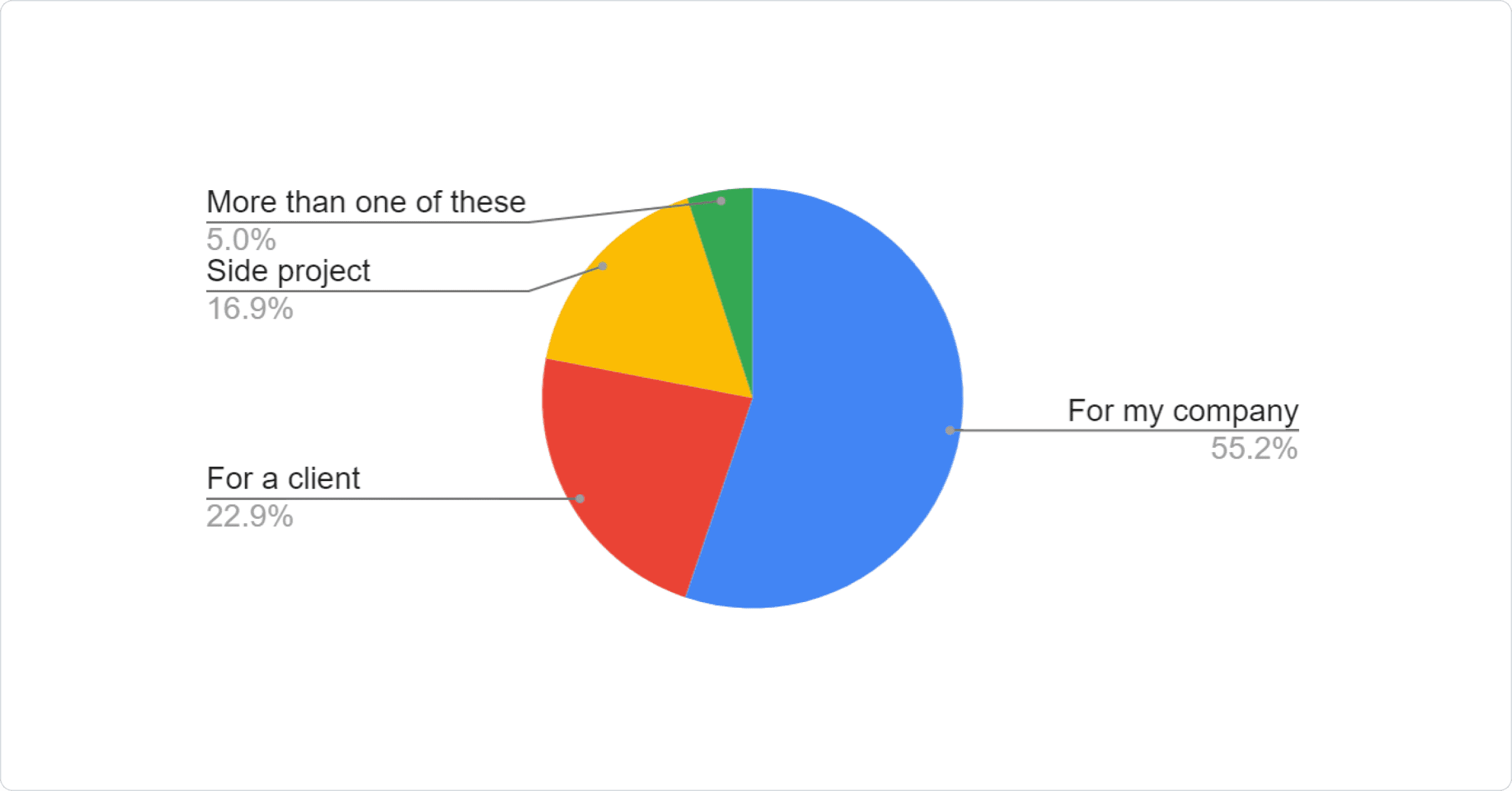
17. Who are you building it for?
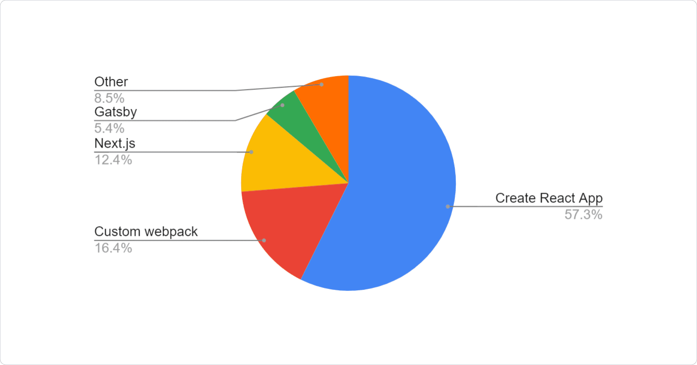
18. Which JavaScript framework are you using, if any?
19. What styling system are you using?
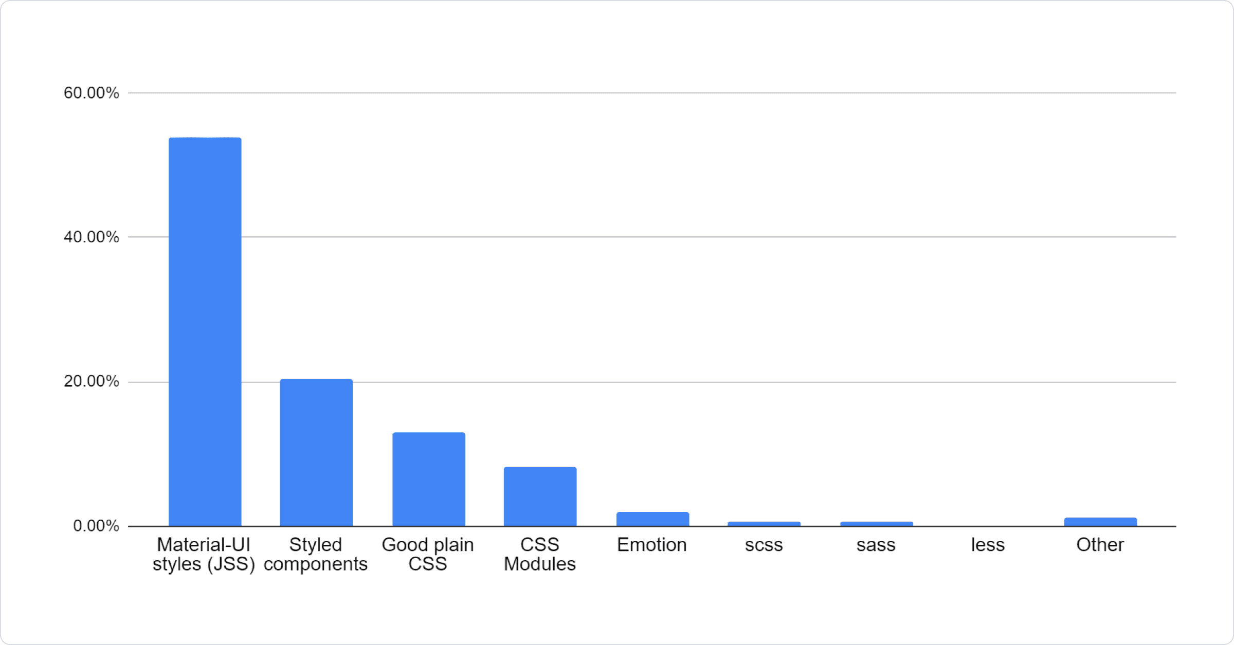
The response seems to be similar to the one from the last year's survey, so we will push with better support for styled components.
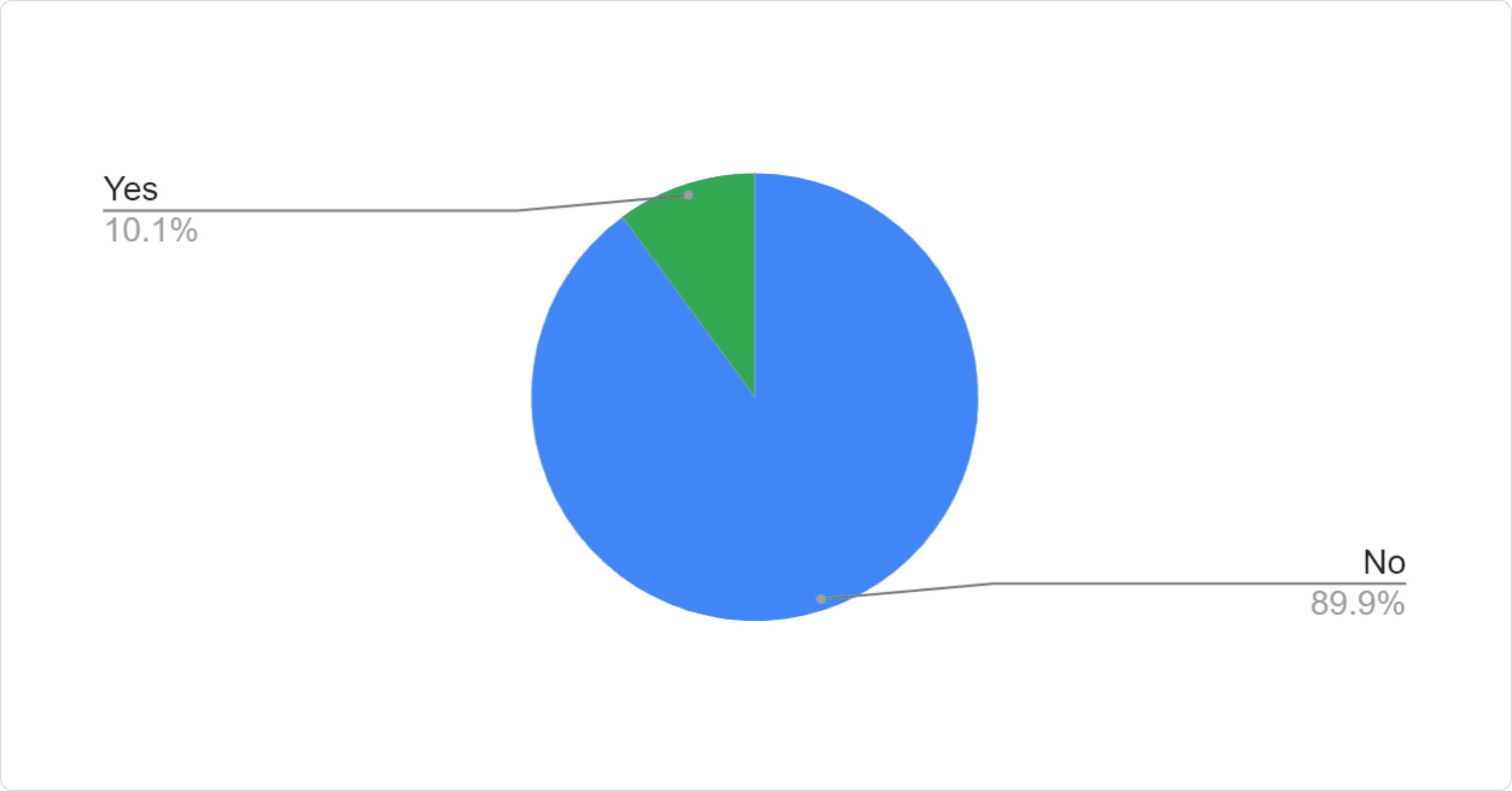
20. Has your organization ever paid for UI components?
21. What type system are you using?
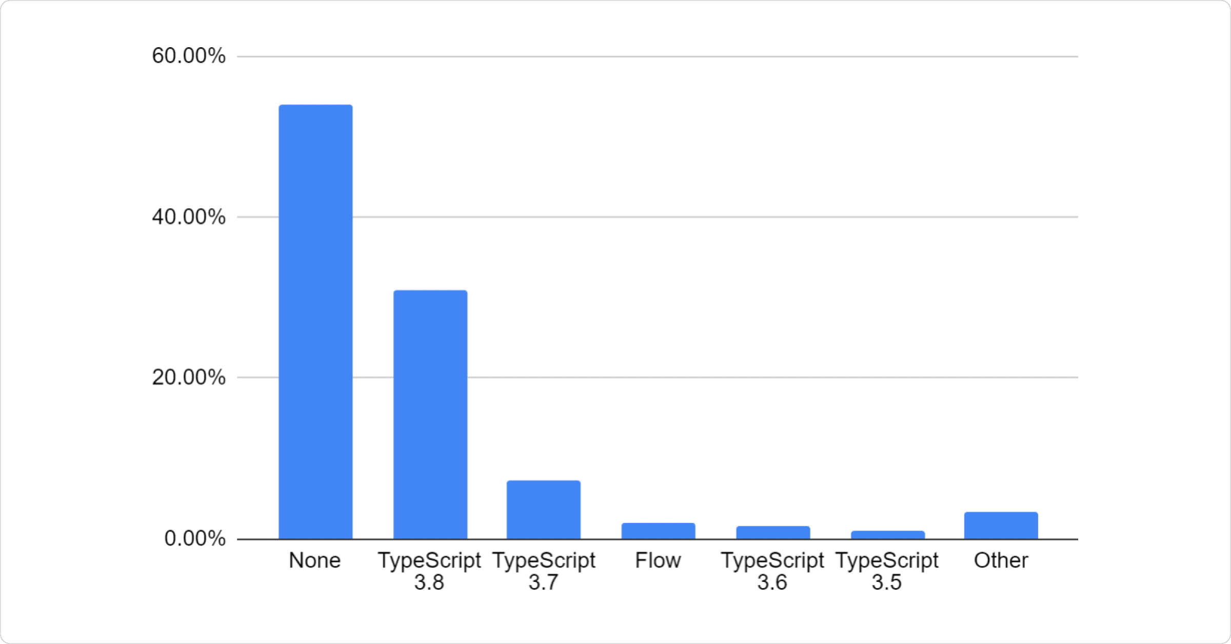
Almost half of the community is using TypeScript. Next year, it might even become more popular than JavaScript.
Conclusion
This data is incredibly valuable for our team. Thank you again for participating! We want to work on the problems that resonate the most with our users. It's clear that we should:
- Provide more flexibility on the components, unstyled components (pure hooks?).
- Make the customization easier and implement custom themes with Material UI. Maybe provide a theme builder.
- Provide a second theme, update the current components to better match Material Design, provide more simple components and features (for example dropzone, carousel) as well as provide a better DX (there are good ideas from other UI libraries to apply to Material UI v5).
- Improve upon the paid advanced versions of the components (for example complex data grid, date range picker, tree view drag & drop, virtualization, etc).
We will update our ROADMAP in the coming days. We will run a similar survey next year to keep track of our progress.
If you want to continue to influence our roadmap, please upvote 👍 the issues you are the most interested in on GitHub.
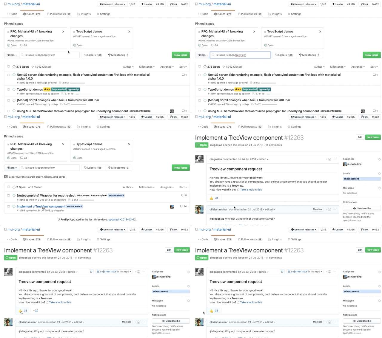
Help us prioritize by upvoting.