An exciting year ahead for Base UI
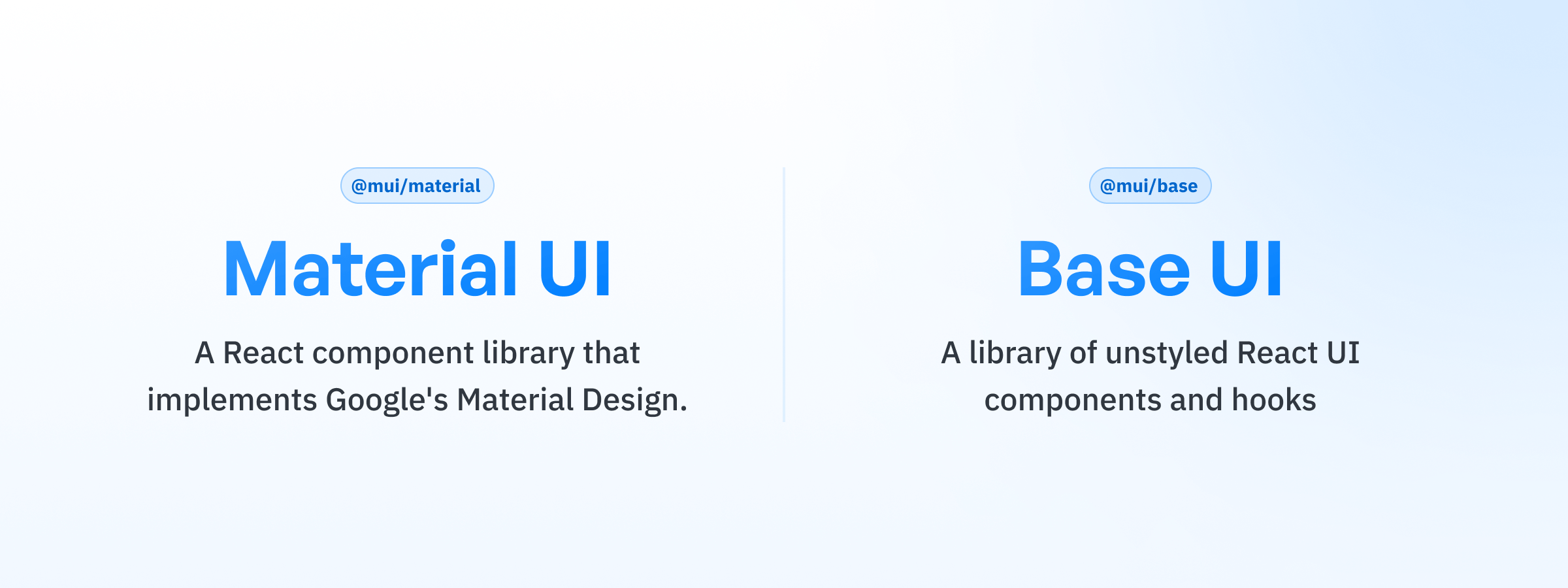
The story of Base UI began several years ago—long before headless React component libraries skyrocketed in popularity—when we started to imagine a world in which Material UI could exist without Material Design.
We're super excited to share that this dream is becoming a reality! This year will see a lot of investment in Base UI as we expand the team and focus hard on a stable release (tentatively planned for late 2024), which will come full of new components, features, and improvements.
Let's walk through some of the things we're cooking up.
A larger set of components
Base UI today offers a modest set of components and hooks, including some slightly more complex ones such as Autocomplete and Number Input. However, we're aware that the package is still missing many primitive components that developers would need in order to adopt it for real-world applications. Fear not, because we're working hard to ship more components with the stable release, including:
| Components to be added | |
|---|---|
| Accordion | View the GitHub issue → |
| Alert Dialog | View the GitHub issue → |
| Checkbox | View the GitHub issue → |
| Collapsible | View the GitHub issue → |
| Drawer | View the GitHub issue → |
| Radio Group | View the GitHub issue → |
| Tooltip | View the GitHub issue → |
And potentially more! We'd love for you to chime in and help us prioritize, so keep an eye on the open issues.
Improved customization API
Currently, Base UI components can be customized to your heart's content using the slots and slotProps props.
(Read more about them in the "Overriding component structure" guide.)
// Example of the slots prop
<Select slots={{ listbox: 'ol' }} defaultValue="First option">
  <Option value="First option">First option</Option>
  <Option value="Second option">Second option</Option>
</Select>

// Example of the slotProps prop
<Badge slotProps={{ badge: { className: 'my-badge' } }} />
This API, while powerful, has proven to be less than ideal in some instances.
Most notably, it's too lengthy and complicated to write and read when used with libraries such as Tailwind CSS.
Additionally, since the slots and the corresponding slotProps are not related in terms of TypeScript types, it's possible to introduce bugs or have the compiler complain about valid code.
To address these issues, we're considering adopting a new API that would assign a discrete subcomponent to each DOM node—the pattern favored by many other headless component libraries (think: <Slider.Track />, <Slider.Thumb />, etc.).
This pattern has the potential to radically improve the customization experience, both for styles and structure.
We are still fleshing out the API and implementation details. If you have any questions or remarks about this change, chime in on the RFC on GitHub.
We know that a significant number of projects depend on the existing API, and we want to assure you that one of our top priorities is to provide a smooth migration experience.
More thorough animation support
Animation is a key element for adding delight to any application.
We've already kicked off work on animation support by releasing the CSS Transition and CSS Animation components, as well as the useTransitionTrigger and useTransitionStateManager hooks.
They're currently available for use with the Popup, Menu, and Select, and the plan is to extend support to more components while also adding more features.
The CSS Animation transition is exaggerated here for the sake of demonstration.
Getting many issues out of the way
The core of what Base UI strives to deliver out of the box is first-class accessibility and an intuitive API for extensive customization. We've earmarked several issues we want to tackle before the stable release in areas such as keyboard navigation, better ARIA support, focus styles, and more.
A more independent product
So far, all Base UI-related development has happened within the Material UI GitHub repository. That made a lot of sense in the beginning because we didn't intend for Base UI to be a standalone product at the time. As a result of this early decision, we've seen that some developers are hesitant to try it out because of the apparent association with Material Design. Rest assured that Base UI is a standalone library, and it doesn't come packaged with any default styles or themes.

Base UI is no longer merely "Material UI without the styles"—as we've seen with developer trends over the last few years, the potential for growth and adoption of headless components could actually dwarf Material UI in the near future. To acknowledge that Base UI has the potential to outgrow Material UI, we plan to move it to its own dedicated GitHub repository for more focused communication and collaboration with the community that's growing around it.
Help us on the ride
We'd love to hear your feedback. The best place to share your ideas and requests is in the GitHub repository. Check out the existing issues and add your thoughts, and feel free to open your own issue if you don't see your concerns addressed elsewhere.
Happy development! 👋