MUI Core /Material UI
Ready to use
Material Design
components
Material UI is an open-source React component library that implements Google's Material Design. It's comprehensive and can be used in production out of the box.


The world's best product teams trust MUI to deliver an unrivaled experience for both developers and users.
Component library
40+ building block components
A meticulous implementation of Material Design; every Material UI component meets the highest standards of form and function.
Own the styling!
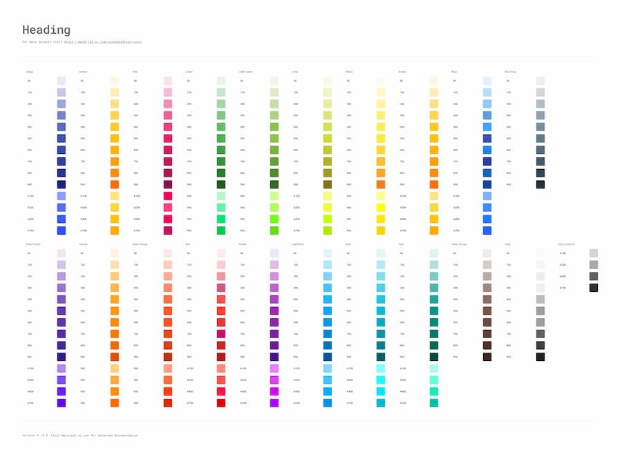
Build your own design system using the sophisticated theming features. You can also start by using Google's Material Design.
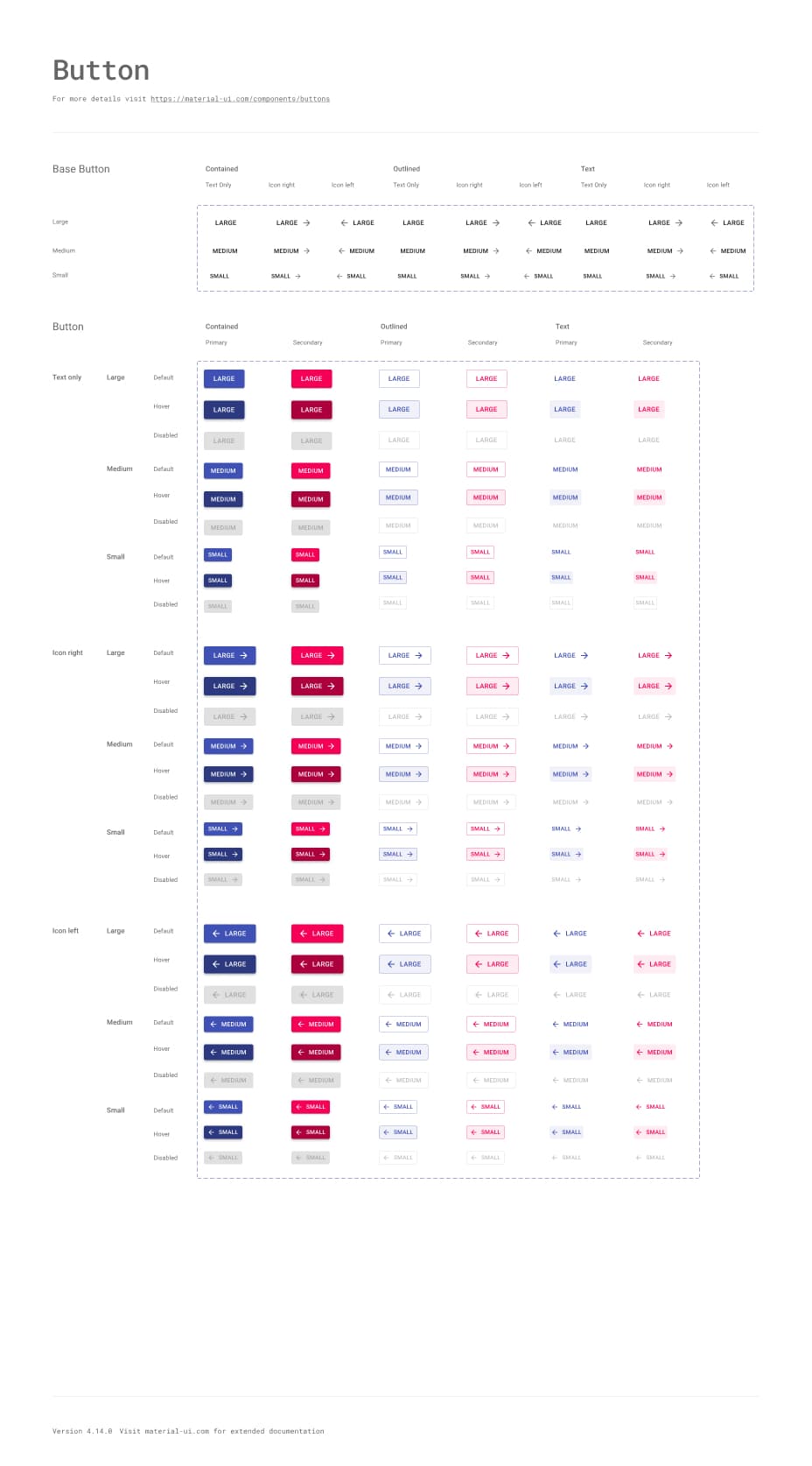
<Button variant="text" startIcon={<ShoppingCartRounded />}>
  Add item
</Button>
<Button variant="contained" startIcon={<ShoppingCartRounded />}>
  Add item
</Button>
<Button variant="outlined" startIcon={<ShoppingCartRounded />}>
  Add item
</Button>Theming
Build your design system just as you want it to be
Start quickly with Material Design or use the advanced theming feature to easily tailor the components to your needs.

Contemplative Reptile
Sounds of Nature<Card
variant="outlined"
sx={{
p: 2,
width: { xs: '100%', sm: 'auto' },
display: 'flex',
flexDirection: { xs: 'column', sm: 'row' },
alignItems: 'center',
gap: 2,
}}
>
<CardMedia
component="img"
width="100"
height="100"
alt="Contemplative Reptile album cover"
src="/images/contemplative-reptile.jpg"
sx={{
width: { xs: '100%', sm: 100 },
}}
/>
<Stack direction="column" alignItems="center" spacing={1} useFlexGap>
<div>
<Typography color="text.primary" fontWeight="semiBold">
Contemplative Reptile
</Typography>
<Typography
variant="caption"
color="text.secondary"
fontWeight="medium"
textAlign="center"
sx={{ width: '100%' }}
>
Sounds of Nature
</Typography>
</div>
<Stack direction="row" alignItems="center" spacing={1} useFlexGap>
<IconButton aria-label="Shuffle" disabled size="small">
<ShuffleRoundedIcon fontSize="small" />
</IconButton>
<IconButton aria-label="Fast rewind" disabled size="small">
<FastRewindRounded fontSize="small" />
</IconButton>
<IconButton
aria-label={paused ? 'Play music' : 'Pause music'}
onClick={() => setPaused((val) => !val)}
sx={{ mx: 1 }}
>
{paused ? <PlayArrowRounded /> : <PauseRounded />}
</IconButton>
<IconButton aria-label="Fast forward" disabled size="small">
<FastForwardRounded fontSize="small" />
</IconButton>
<IconButton aria-label="Loop music" disabled size="small">
<LoopRoundedIcon fontSize="small" />
</IconButton>
</Stack>
</Stack>
</Card>Styling
Rapidly add and tweak any styles using CSS utilities
CSS utilities allow you to move faster and make for a smooth developer experience when styling any component.
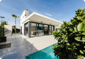
$280k - $310k
<Card
  variant="outlined"
  sx={{
    p: 2,
    display: 'flex',
    flexWrap: 'wrap',
    zIndex: 1,
  }}
>
  <CardMedia
    component="img"
    width="100"
    height="100"
    alt="123 Main St, Phoenix, AZ cover"
    src="/images/real-estate.png"
    sx={{
      borderRadius: '6px',
      width: { xs: '100%', sm: 100 },
    }}
  />
  <Box sx={{ alignSelf: 'center', ml: 2 }}>
    <Typography variant="body2" color="text.secondary" fontWeight="regular">
      123 Main St, Phoenix, AZ, USA
    </Typography>
    <Typography fontWeight="bold" noWrap gutterBottom>
      $280k - $310k
    </Typography>
    <Chip
      size="small"
      variant="outlined"
      icon={<InfoRounded />}
      label="Confidence score: 85%"
      sx={(theme) => ({
        '.MuiChip-icon': { fontSize: 16, ml: '4px', color: 'success.500' },
        bgcolor: 'success.50',
        borderColor: 'success.100',
        color: 'success.900',
        ...theme.applyDarkStyles({
          bgcolor: 'primaryDark.700',
          color: 'success.200',
          borderColor: 'success.900',
        }),
      })}
    />
  </Box>
</Card>
Templates
The right template for your
specific use case
A carefully curated collection of gorgeous, fully functional templates.
Community
Join our global community
Material UI wouldn't be possible without our global community of contributors. Join us today to get help when you need it, and lend a hand when you can.
Material UI vs. Base UI
Material UI implements Google's Material Design whereas Base UI features many of the same components, but without the Material Design implementation.
Does it support Material Design 3?
The adoption of Material Design 3 is tentatively planned for Material UI v7. See the the release schedule and follow this GitHub issue for future updates.

