Button
Learn about the button component and it's usage in Toolpad Studio.
Demo
Buttons allow users to take actions, make choices with a single tap.
Usage
Button component becomes usable through an onClick event handler property. It is used to instruct what action to happen in the event of a click. It supports two tabs:
JS Expression
You can write any valid JavaScript that you want to execute on the click of button. It can change component state or call backend code. Below video shows how on a button click, the user input can be shown on a page in a text field component:
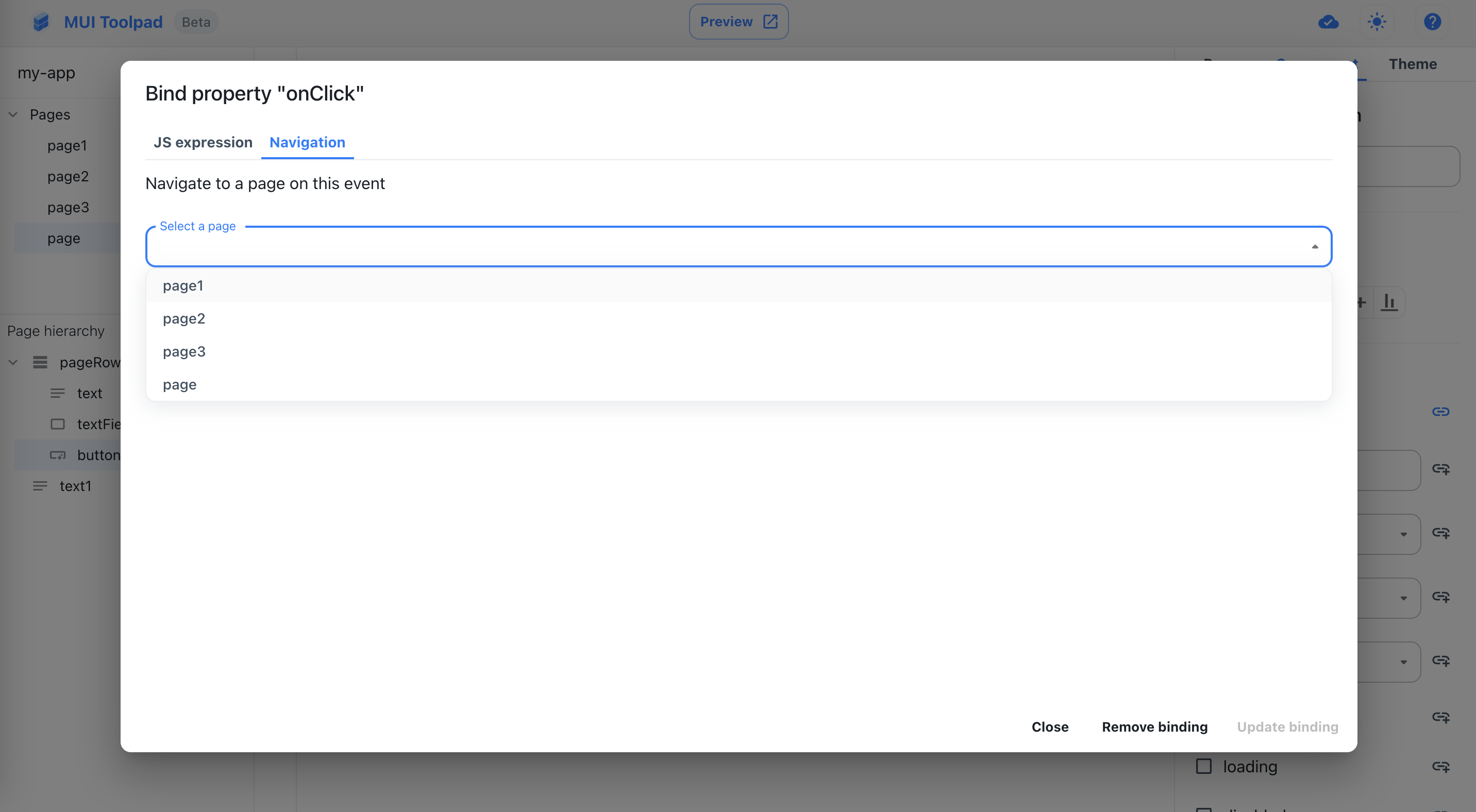
Navigation
From this tab, you can configure to move from one page to the other in a Toolpad Studio app.

Navigating to a page on button click
Appearance
The Button component has multiple variations supported in Toolpad Studio, which can be seen below.
variant
The variant property supports three different options: contained (default), outlined and text. Contained is a high-emphasis button suited for a primary action. Outlined is for low-emphasis, secondary action. Text is used for less-pronounced actions that ensure user remains focused on the main content.
color
The color property has two options: primary (default) and secondary. These take input from the global theme that you set in Toolpad Studio from the theme tab.
size
The size property supports three options: small (default), medium and large.
State
Button supports states like loading and disabled to share the state of the component so that user can wait/act accordingly.
API
See the documentation below for a complete reference to all props available to the button component in Toolpad Studio.